

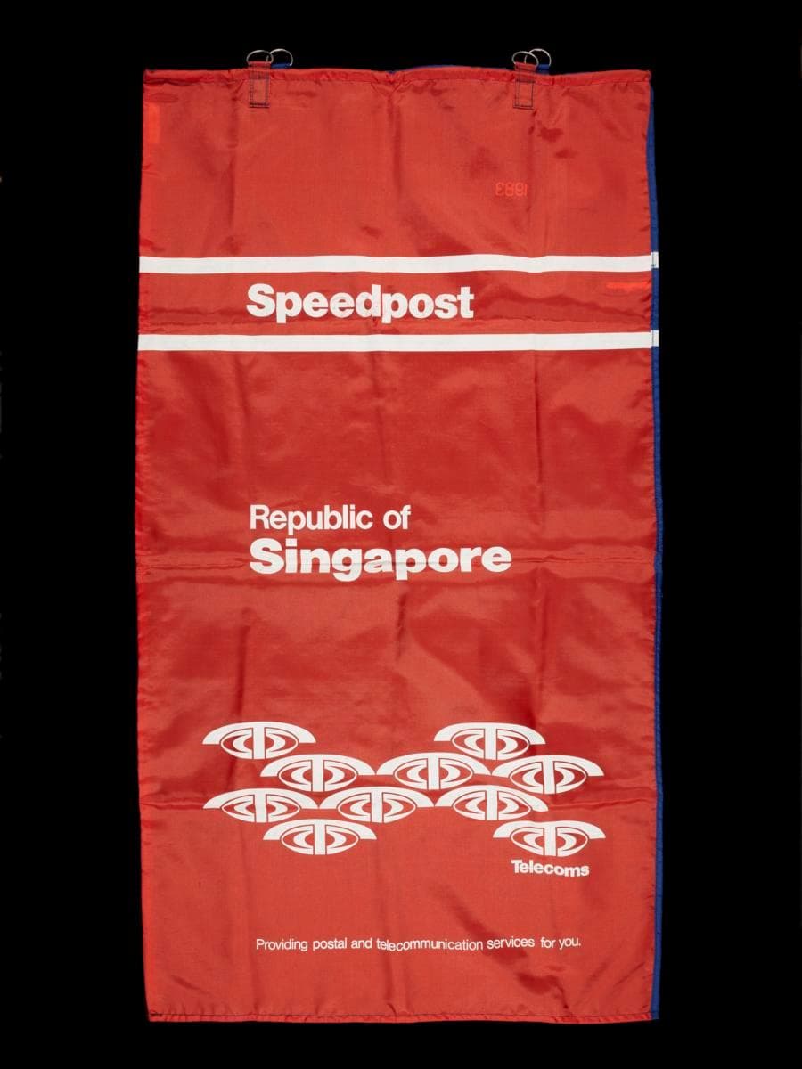
In the 1980s, Singapore’s mail was collected by postmen from over 700 postboxes island-wide and manually sorted at the Mail and Parcels Centre in Chai Chee Industrial Park before being delivered to addressees. This is a prototype of a Telecoms mail bag used during this period of rapid postal expansion, following the merger of the telecommunications authority with the postal services department in 1982 and before the incorporation of Singapore Post Limited (SingPost) in 1992.It was likely designed by Hengdesign Associates, one of Singapore's leading modernist design studios established in 1974 by U.S.-trained principal designer James Heng. Hengdesign Associates was first commissioned to oversee Telecoms' logo redesign in the late 1970s. The design firm went on to develop a refreshed corporate identity for Telecoms during the early to mid 1980s, which was systematically applied to its business forms, signs, and stationery, and corporate vehicles, projecting a unified presence across multiple touchpoints. Made of water-resistant polyester, postal bag stands out with a bold colour contrast—paprika orange on the front, echoing Telecoms' corporate identity— and a vibrant ultramarine blue on the back. The text is set in clean Helvetica sans serif, with ‘Singapore’ and ‘Speedpost’ boldly emphasised for visual impact. ‘Speedpost’ is framed by twin white lines, a nod to the design of Telecoms’ official letterheads. A repeated cluster of Telecoms logos at the bottom adds a dynamic touch, symbolising abundance and connectivity—an eye-catching motif that also features across the company’s corporate stationery and envelopes. More than just a functional item, the mail bag serves as a historical artifact—offering insight into the equipment and processes that supported the transformation of Singapore’s postal system. It also tells a story of rising demand in postal communication; by 1991, domestic mail volume had reached 316 million items, with 270,000 kilograms of surface airlifted mail handled that same year.