

Object size: 29.7 x 21.0 cm,
Object size: 7.6 x 7.6 cm,
Object size: Refer to parts
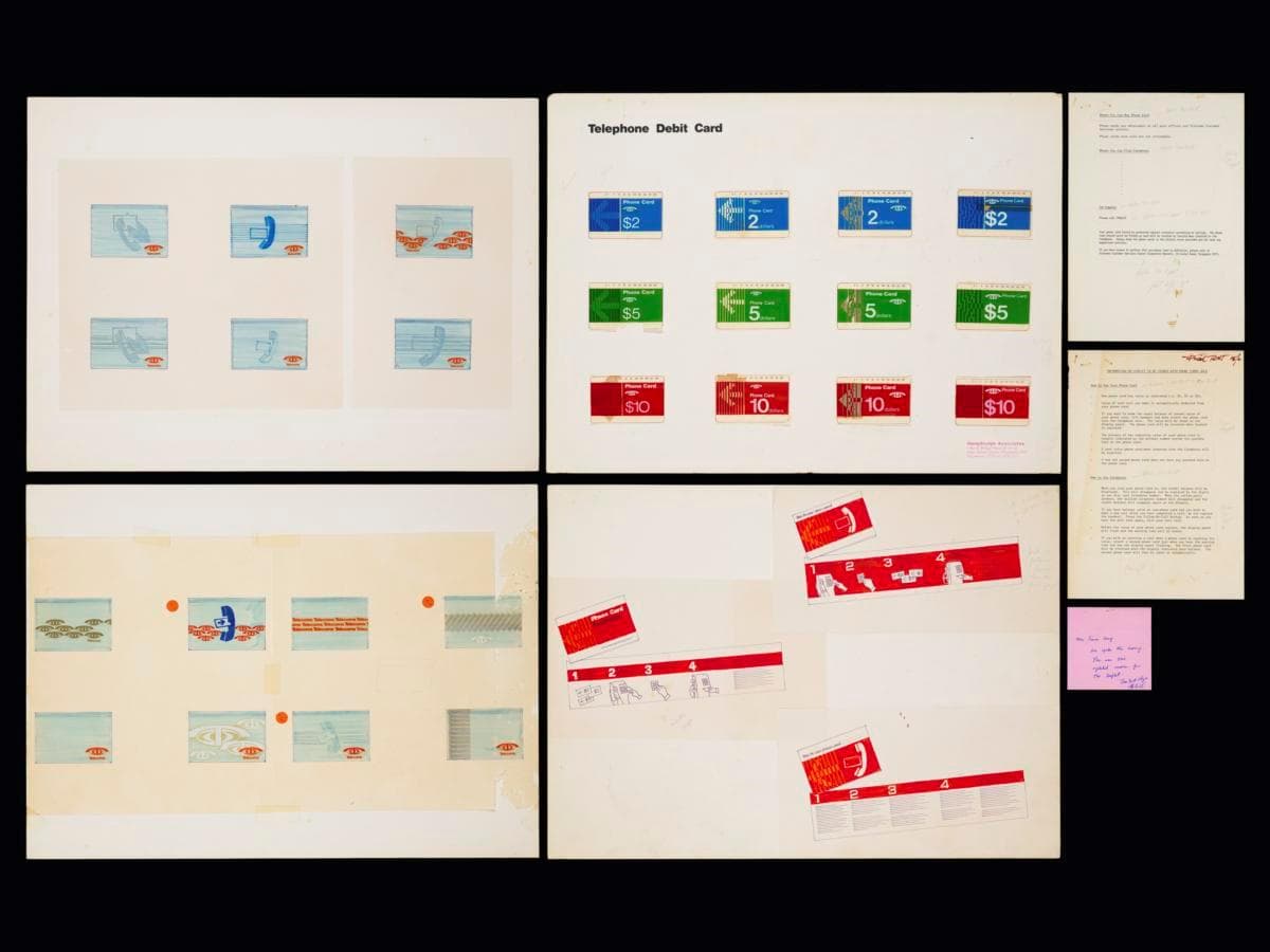
This set of prototypes presents the front and back designs of Telecoms magnetic phone cards, introduced in 1985 for use with public payphones in Singapore. While Hengdesign experimented with colours to distinguish between the different denominations i.e. blue for $2, green for $5 and its corporate colour of paprika orange for $10, the final design adopted a standardised orange colour across all cards. It was designed by Hengdesign Associates, one of Singapore's leading modernist design studio established in 1974 by U.S.-trained principal designer James Heng.Hengdesign Associates was first commissioned to oversee Telecoms' logo redesign in the late 1970s, a pivotal period when the statutory board was preparing to introduce more advanced and futuristic telecommunications services. The improved logo, unveiled on 5 October 1979, featured a ‘T’ in striking paprika orange resembling a stylised telephone receiver, arching over a globe — a motif retained from the previous emblem. It embodied a sense of modernity, dynamism and progress, mirroring Telecoms' ambition to position Singapore as a regional and global hub in digital telecommunications. The design firm went on to develop a refreshed corporate identity for Telecoms during the early to mid-1980s, which was systematically applied to its business forms, signs, and stationery, and corporate vehicles, projecting a unified presence across multiple touchpoints. It also updated the designs of public payphone booths and created designs for prepaid phone cards, which improved the way calls were made with greater accessibility and convenience. These phone cards feature the updated Telecoms logo, with the card’s value prominently displayed and a bold, left-facing arrow indicating the correct direction for insertion into the slot.