

Image size: 43.1 x 29.8 cm
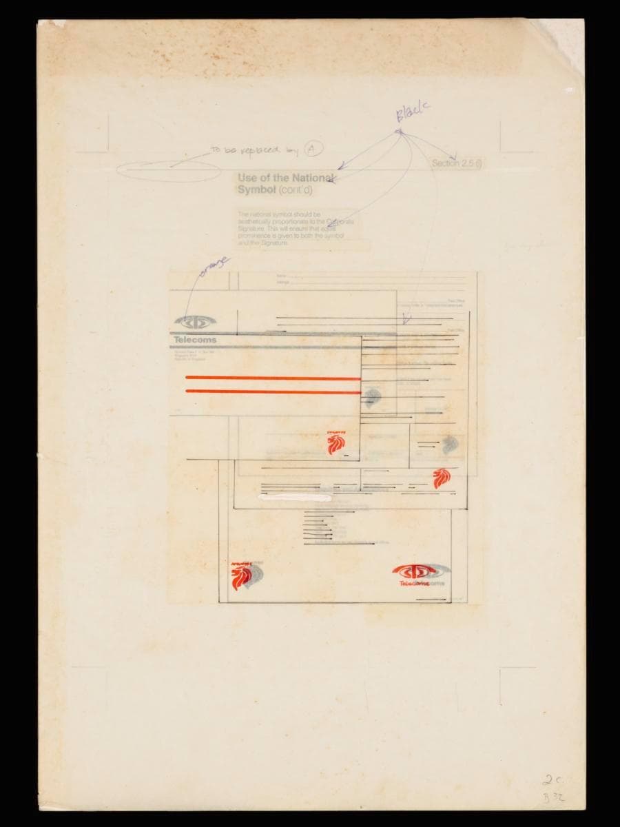
This prototype presents a logo manual developed as part of the corporate rebranding campaign of Telecoms, led by Hengdesign Associates from 1979 until the mid-1980s. It outlines the guidelines for applying the lion head symbol and Telecoms corporate emblem across all its official forms and stationery. The rebranding of Telecoms was led by U.S.-trained principal designer James Heng of Hengdesign Associates. The design studio played a major role in shaping some of Singapore's most iconic corporate identities in the 1970s and 1980s such as that of NTUC FairPrice, Oversea-Chinese Banking Corporation and Singapore Press Holdings. The redesigned logo, unveiled on 5 October 1979, featured a striking paprika orange ‘T’ stylised as a telephone receiver arching over a globe — a motif retained from the previous emblem. It embodied a sense of modernity, dynamism and progress, mirroring the ambition of Telecoms to position Singapore as a global leader in digital telecommunications. The lion head emblem was to be aesthetically proportionate to the Telecoms corporate logo and signature, to ensure equal prominence was given to both. Both were reproduced in the same distinctive shade of paprika orange, ensuring visual consistency and brand recognition. The inclusion of the national symbol into the telecommunications agency's corporate stationery reflected how government bodies like Telecoms played a role in fostering national pride and solidarity. During the formative nation-building decades of the 1960s to 1980s, such visual expressions helped strengthen a shared sense of identity and purpose among Singaporeans.