

Image size: 43.9 x 61.0 cm
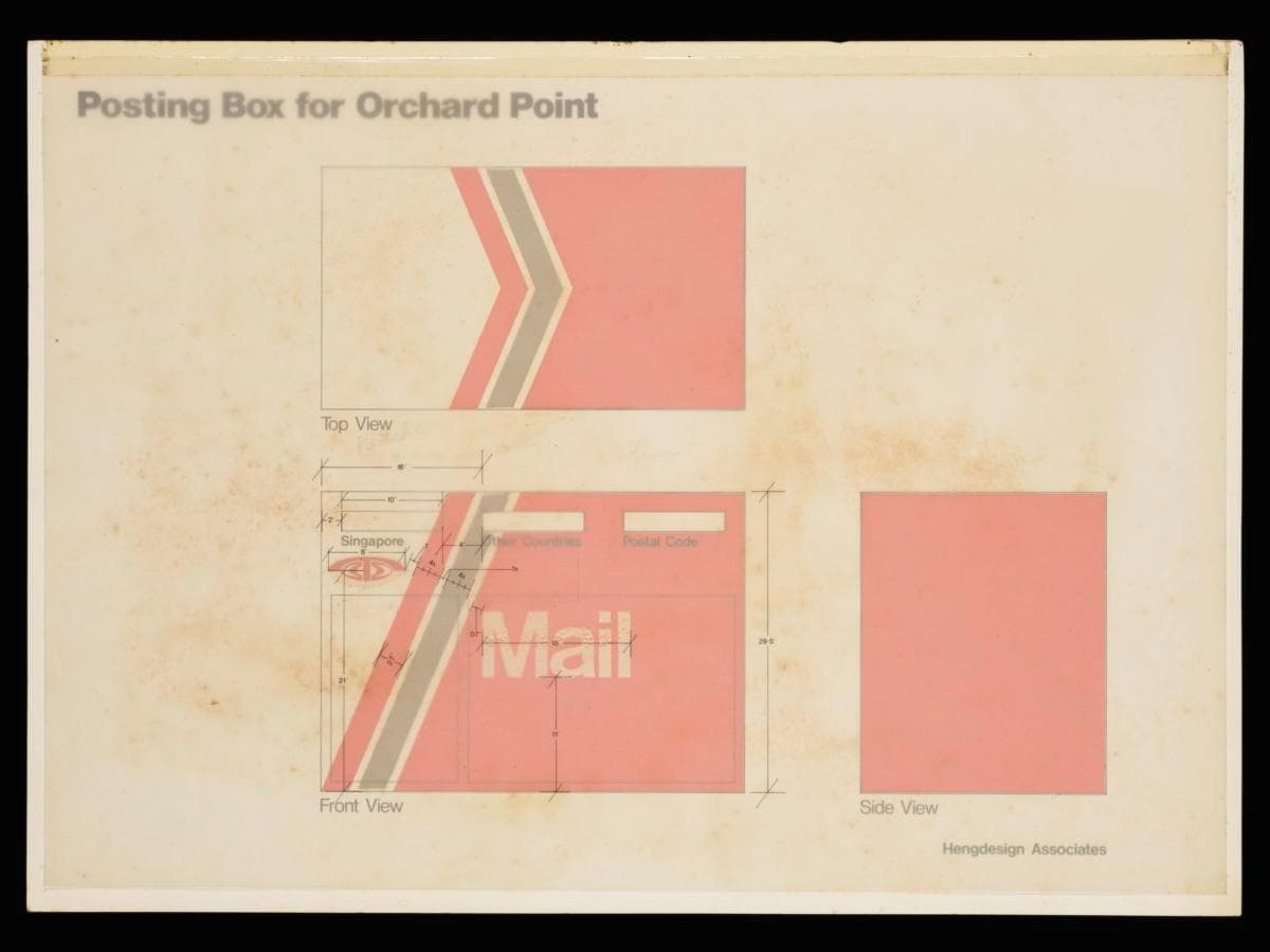
This prototype presents the application of Telecoms' refreshed corporate identity on the postbox at the Orchard Point post office. Designed by Hengdesign Associates, it features bold strokes of paprika orange sweeping diagonally across three-quarters of the postbox, contrasted with a corner of white, giving an impression of movement and dynamism. A subtle band of warm grey (Pantone 403)—Telecoms’ secondary colour—serves as a visual accent, echoing its use on other assets like scooters and bicycles. Collectively, the colour palette and composition convey movement, energy, and a modern outlook—turning the postbox into an expression of the brand.This corporate identity design reflects the 1982 merger of Telecoms with the Postal Services Department, which unified telecommunications and postal operations. The integration transformed post offices and customer service centres into convenient, one-stop hubs offering both services.Hengdesign Associates, helmed by U.S.-trained principal designer James Heng, had been commissioned to oversee the redesign of the Telecoms logo in 1979, a pivotal moment when the statutory board was preparing to introduce more advanced and futuristic telecommunications services. It also created a refreshed corporate identity for the agency, which was adapted to its business forms, signs, stationery and corporate vehicles, projecting a unified presence across multiple touchpoints.