

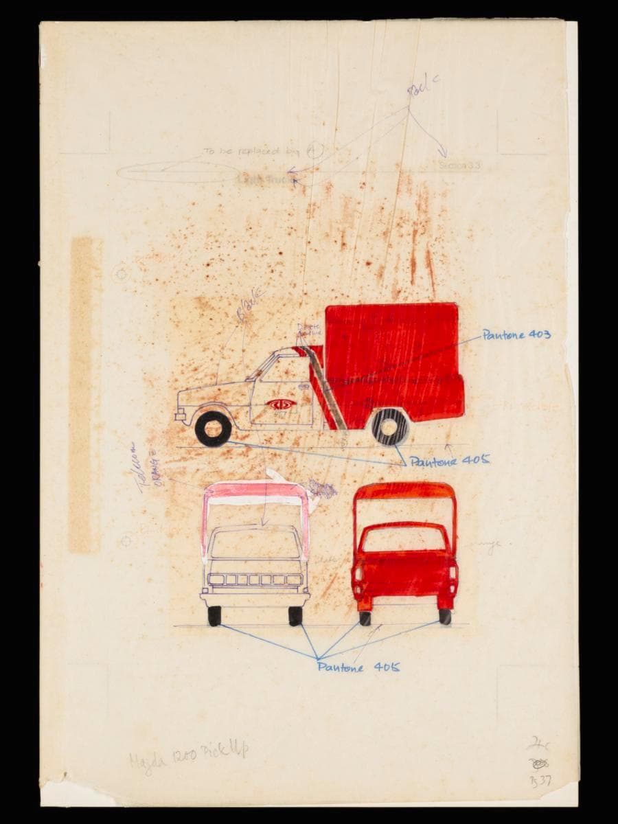
Image size: 43.2 x 29.7 cm
Introduced in the 1980s, the Mazda 1200 pickup trucks signaled a new phase in the expanding service capabilities of Telecoms. As sturdy counterparts to the van fleet, these vehicles embodied both scale and adaptability. They were possibly used for transporting manpower, equipment and materials used in installing, maintaining, and repairing telecommunications infrastructure and amenities including public payphones, which were essential fixtures across Singapore at the time.This prototype shows how the refreshed corporate identity of Telecoms was applied to its pickup trucks. It was designed by Hengdesign Associates as part of the corporate rebranding campaign of Telecoms which began in 1978. The design features bold strokes of paprika orange sweeping diagonally across two-thirds of the vehicle, contrasted with the remaining white segment, giving an impression of movement and dynamism. A subtle band of warm grey (Pantone 403)—Telecoms’ secondary colour—serves as a visual accent, echoing its use on other assets like scooters and public postal boxes. Collectively, the colour palette and composition convey movement, energy, and a modern outlook—turning the pickups into mobile expressions of the brand.Helmed by U.S.-trained principal designer James Heng, Hengdesign Associates played a major role in shaping some of Singapore's most iconic corporate identities such as that of NTUC FairPrice, Oversea-Chinese Banking Corporation and Singapore Press Holdings. The design studio had been commissioned to oversee Telecoms' logo redesign at a pivotal moment when the statutory board was preparing to introduce more advanced and futuristic telecommunications services in the 1980s.The redesigned logo, unveiled on 5 October 1979, featured a striking paprika orange ‘T’ stylised as a telephone receiver arching over a globe — a motif retained from the previous emblem. It embodied a sense of modernity, dynamism and progress, mirroring the ambition of Telecom to position Singapore as a global leader in digital telecommunications. From forms and signage to stationery and vehicles, Hengdesign’s work unified Telecoms’ presence across all touchpoints—projecting not just a corporate brand, but the image of a futuristic nation charting its path into the future.