

Image size: 43.2 x 30.0 cm
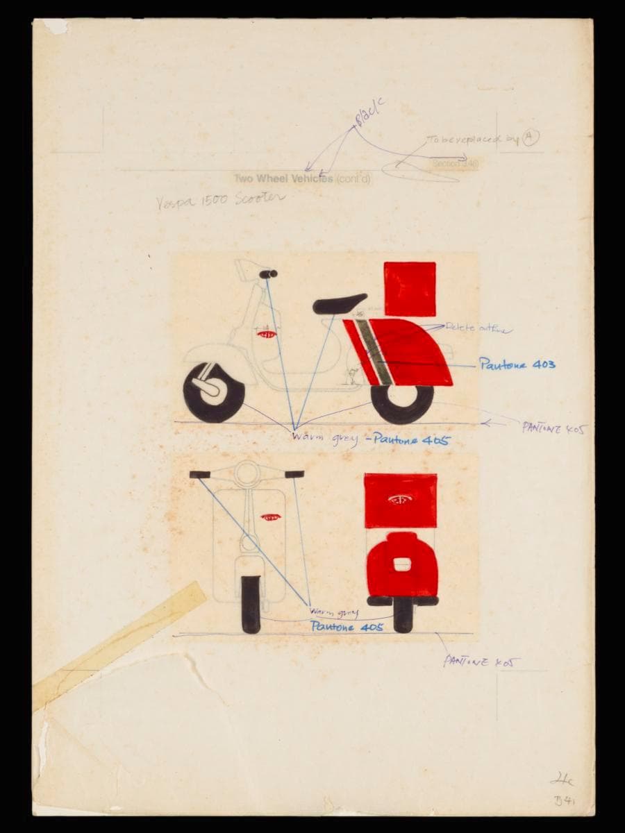
During the 1970s to 1980s, scooters —outfitted with carrier boxes—were a familiar and iconic sight, zipping through Singapore’s streets as Telecoms staff and contractors used it to deliver mail, as well as provide telephone installation and maintenance services. This prototype presents the implementation of the corporate visual identity of Telecoms on its fleet of scooters, as part of a corporate rebranding campaign by Hengdesign Associates which began in 1979. Helmed by U.S.-trained principal designer James Heng, the design studio had been commissioned to oversee the redesign of the Telecoms logo at a pivotal moment when the statutory board was preparing to introduce more advanced and futuristic telecommunications services in the 1980s.The redesigned logo, unveiled on 5 October 1979, featured a striking paprika orange ‘T’ stylised as a telephone receiver arching over a globe — a motif retained from the previous emblem. It embodied a sense of modernity and progress, mirroring Telecoms' ambition to position Singapore as a global leader in digital telecommunications. The new logo can be seen affixed prominently on both sides of the vehicles near the handlebars in this mood board. It is framed by bold strokes of paprika orange, the primary corporate colour of the organisation, sweeping diagonally across two-thirds of vehicle, giving an impression of speed and dynamism. The interplay of crisp white, vivid paprika orange, and the strip of grey accent creates an impactful and eye-catching aesthetic that reinforces the visibility and recognition of Telecoms as a brand gaining in prominence.