

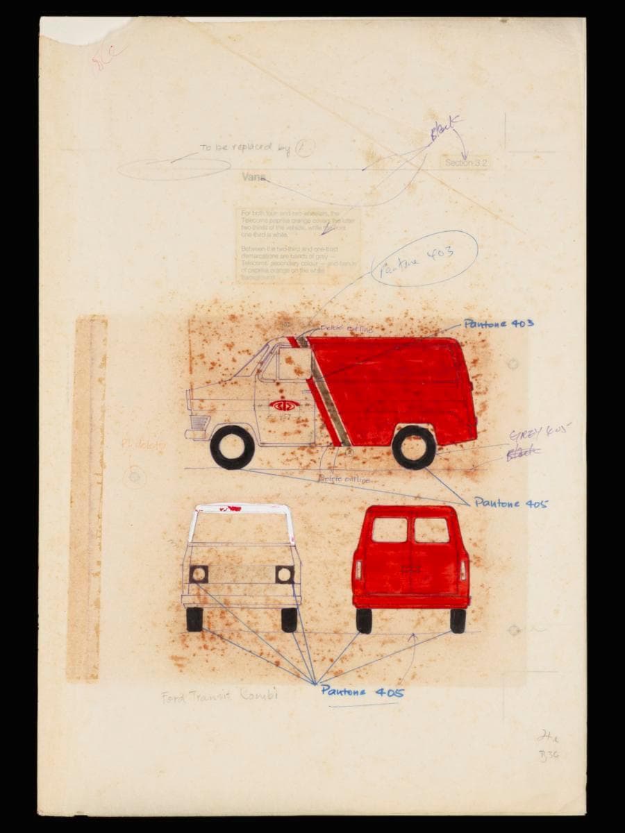
Image size: 43.3 x 29.7 cm
In the 1980s, a key addition to the growing fleet of Telecoms service vehicles was the Ford Transit Kombi van. Introduced in response to rising demand for telecommunications and postal services—especially after the 1982 merger with the Postal Services Department—these vans became a vital part of the organisation’s island-wide operations.As Singapore’s urban landscape evolved through town planning and commercial development, the modes of mail delivery adapted in tandem — ranging from scooters to vans—each chosen to suit characteristics of the delivery routes and the varying densities of the built environment. Vans proved to be highly versatile. Not only were they efficient in transporting high volumes of mail to longer, less densely populated routes, they also doubled up as mobile postal counters, bringing essential services to neighbourhoods where permanent post offices had yet to be built.This prototype shows how the refreshed corporate identity of Telecoms was applied to its fleet of vans. It was designed by Hengdesign Associates as part of the corporate rebranding campaign of Telecoms which began in 1978. The design features bold strokes of paprika orange sweeping diagonally across two-thirds of the vehicle's body, contrasted with the white, remaining one-third segment, giving an impression of movement and dynamism. A subtle band of warm grey (Pantone 403)—the secondary colour of Telecoms—serves as a visual accent, echoing its use on other assets like scooters and public postal boxes. Collectively, the colour palette and composition convey movement, energy, and a modern outlook—turning the vans into mobile expressions of the brand.Helmed by U.S.-trained principal designer James Heng, Hengdesign Associates played a major role in shaping some of Singapore's most iconic corporate identities such as that of NTUC FairPrice, Oversea-Chinese Banking Corporation and Singapore Press Holdings. The design studio had been commissioned to oversee Telecoms' logo redesign at a pivotal moment when the statutory board was preparing to introduce more advanced and futuristic telecommunications services in the 1980s. From forms and signage to stationery and vehicles, Hengdesign’s work unified Telecoms’ presence across all touchpoints—projecting not just a corporate brand, but the image of a nation charting its path into the future.