

Image size: 43.1 x 29.7 cm
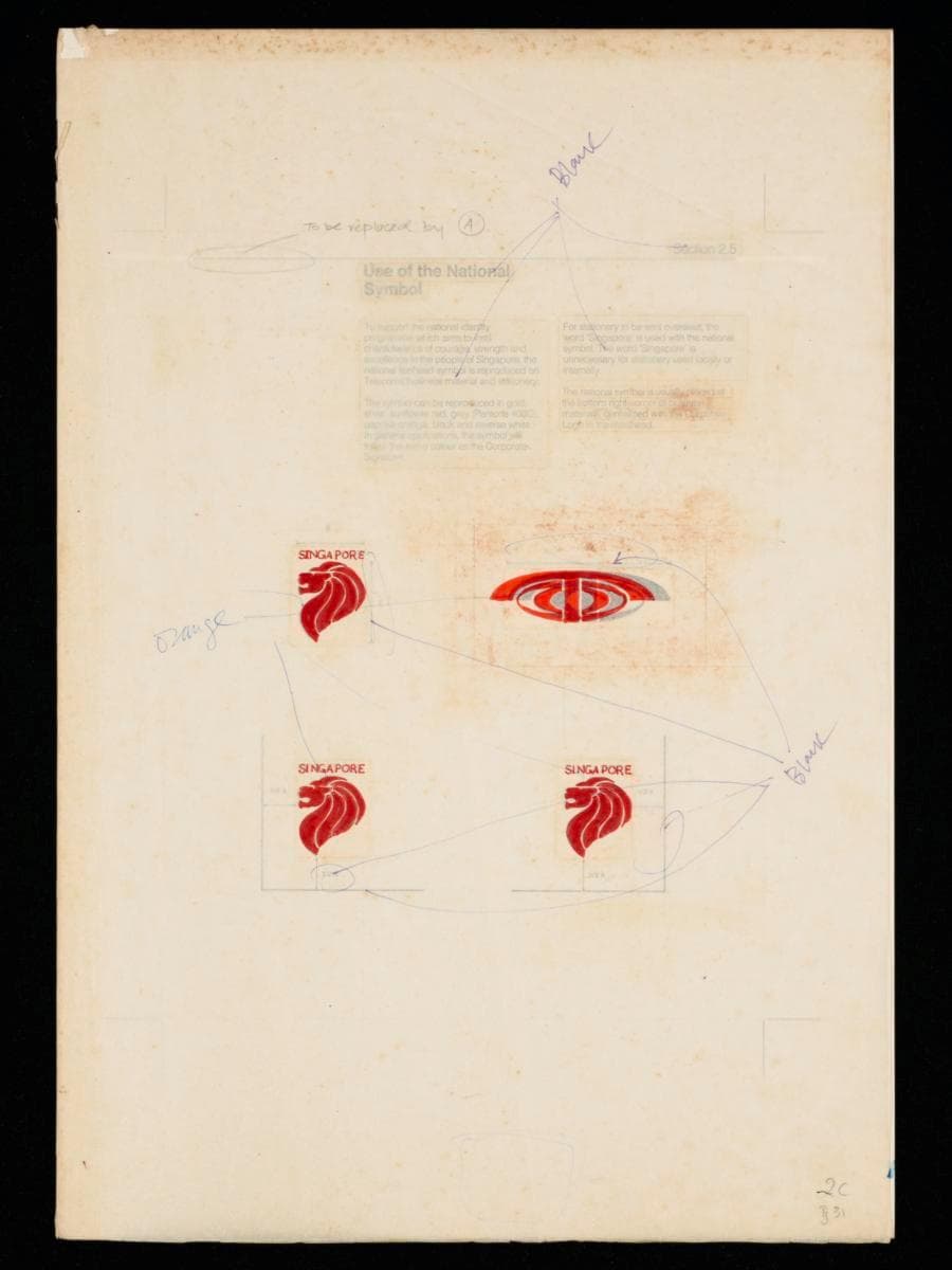
This is a prototype of a logo manual developed as part of the corporate rebranding campaign of Telecoms led by Hengdesign Associates which commenced in 1979. It outlines the guidelines for applying the lion head symbol and the corporate emblem of Telecoms across all its official forms and stationery. One key visual distinction between domestic and international materials was the additional use of the word "Singapore" alongside the national symbol on materials intended for overseas use. The lion head emblem was to be consistently placed at the bottom right-hand corner of all business materials, aligned centrally with the corporate logo in the masthead. The national symbol, corporate logo and signature were reproduced in the same distinctive shade of paprika orange, ensuring visual consistency and brand recognition.Helmed by U.S.-trained principal designer James Heng, Hengdesign Associates played a major role in shaping some of Singapore's most iconic corporate identities such as that of NTUC FairPrice, Oversea-Chinese Banking Corporation and Singapore Press Holdings. The design studio had been commissioned to oversee the redesign of the Telecoms logo at a pivotal moment when the statutory board was preparing to introduce more advanced and futuristic telecommunications services in the 1980s.The redesigned logo, unveiled on 5 October 1979, featured a striking paprika orange ‘T’ stylised as a telephone receiver arching over a globe — a motif retained from the previous emblem. It embodied a sense of modernity, dynamism and progress, mirroring ambition of Telecoms to position Singapore as a global leader in digital telecommunications.