

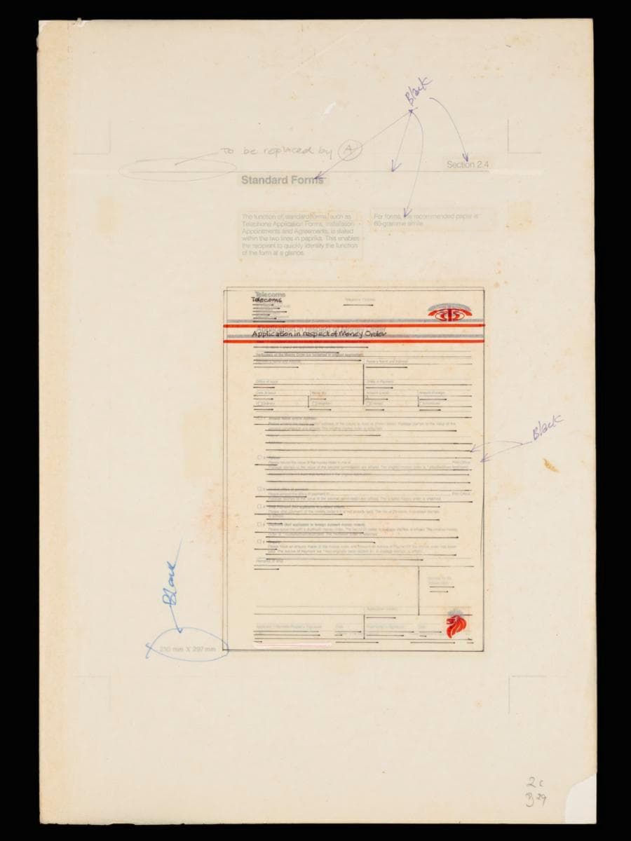
Image size: 43.1 x 29.7 cm
This is a prototype of a money order application form for Telecoms designed by Hengdesign Associates, as part of a broader corporate rebranding initiative in 1979. The design studio had been commissioned to oversee the redesign of the Telecoms logo at a pivotal moment when the statutory board was preparing to introduce more advanced and futuristic telecommunications services in the 1980s. Led by U.S.-trained principal designer James Heng, Hengdesign Associates played a major role in shaping some of Singapore's most iconic corporate identities during the 1970s to 1980s, such as that of NTUC FairPrice, Oversea-Chinese Banking Corporation and Singapore Press Holdings.The redesigned logo, unveiled on 5 October 1979, featured a striking paprika orange ‘T’ stylised as a telephone receiver arching over a globe — a motif retained from the previous emblem. It embodied a sense of modernity, dynamism and progress, mirroring the ambition of Telecoms to position Singapore as a global leader in digital telecommunications. This money order form is designed using a two-colour grid matrix, with key elements such as the company logo and national emblem highlighted in orange for emphasis. The title of the document is neatly framed between two orange lines, enhancing its visual clarity and brand presence.The money order service of Telecoms was likely introduced in 1982 after the merger between the Postal Services Department and the Telecommunication Authority of Singapore (TAS). It enabled customers to send small cash-based foreign remittances of up to SGD 325 over the counter from any Singapore post office to a postal network spanning 30 countries, including Malaysia, Britain, Brunei, and South Korea.